ShopDreamUp AI ArtDreamUp
Deviation Actions
![[SFM] Nature](https://images-wixmp-ed30a86b8c4ca887773594c2.wixmp.com/f/e8442548-797d-44d2-8f22-eb5080e1287c/db4fgt1-523c7e0b-7980-4d60-b48e-08253bddf972.png/v1/fit/w_375,h_211,q_70,strp/_sfm__nature_by_teluzer_db4fgt1-375w.jpg?token=eyJ0eXAiOiJKV1QiLCJhbGciOiJIUzI1NiJ9.eyJzdWIiOiJ1cm46YXBwOjdlMGQxODg5ODIyNjQzNzNhNWYwZDQxNWVhMGQyNmUwIiwiaXNzIjoidXJuOmFwcDo3ZTBkMTg4OTgyMjY0MzczYTVmMGQ0MTVlYTBkMjZlMCIsIm9iaiI6W1t7ImhlaWdodCI6Ijw9NTc2IiwicGF0aCI6IlwvZlwvZTg0NDI1NDgtNzk3ZC00NGQyLThmMjItZWI1MDgwZTEyODdjXC9kYjRmZ3QxLTUyM2M3ZTBiLTc5ODAtNGQ2MC1iNDhlLTA4MjUzYmRkZjk3Mi5wbmciLCJ3aWR0aCI6Ijw9MTAyNCJ9XV0sImF1ZCI6WyJ1cm46c2VydmljZTppbWFnZS5vcGVyYXRpb25zIl19.wO6S7DAU7FBygjgL0ejYEPHY5BDJ--9vLnRYrR8SWVQ)


![Hi I'm Pinkie Pie! [Retake]](https://images-wixmp-ed30a86b8c4ca887773594c2.wixmp.com/f/2c8bf047-7b25-4d3f-9794-835baf84b0ef/dbumxej-cc0ff584-db78-46e4-a934-5e4011d07d36.png/v1/crop/w_92,h_92,x_18,y_0,scl_0.063888888888889,q_70,strp/hi_i_m_pinkie_pie___retake__by_thewhitepone_dbumxej-92s.jpg?token=eyJ0eXAiOiJKV1QiLCJhbGciOiJIUzI1NiJ9.eyJzdWIiOiJ1cm46YXBwOjdlMGQxODg5ODIyNjQzNzNhNWYwZDQxNWVhMGQyNmUwIiwiaXNzIjoidXJuOmFwcDo3ZTBkMTg4OTgyMjY0MzczYTVmMGQ0MTVlYTBkMjZlMCIsIm9iaiI6W1t7ImhlaWdodCI6Ijw9MTQ0MCIsInBhdGgiOiJcL2ZcLzJjOGJmMDQ3LTdiMjUtNGQzZi05Nzk0LTgzNWJhZjg0YjBlZlwvZGJ1bXhlai1jYzBmZjU4NC1kYjc4LTQ2ZTQtYTkzNC01ZTQwMTFkMDdkMzYucG5nIiwid2lkdGgiOiI8PTI1NjAifV1dLCJhdWQiOlsidXJuOnNlcnZpY2U6aW1hZ2Uub3BlcmF0aW9ucyJdfQ.L1ZJ0fEtTNvS4qqFQOTmis43SGTGOzUkyVKkHXLht3Y)


![Rain rain, go away [Remake]](https://images-wixmp-ed30a86b8c4ca887773594c2.wixmp.com/f/7b461616-7c06-4404-9b6b-8cb03f8cdeb0/d9s2utw-72050ed0-9dae-4185-a22a-abc6f94bd704.png/v1/crop/w_184,h_184,x_36,y_0,scl_0.17037037037037,q_70,strp/rain_rain__go_away__remake__by_skrittzs_d9s2utw-92s-2x.jpg?token=eyJ0eXAiOiJKV1QiLCJhbGciOiJIUzI1NiJ9.eyJzdWIiOiJ1cm46YXBwOjdlMGQxODg5ODIyNjQzNzNhNWYwZDQxNWVhMGQyNmUwIiwiaXNzIjoidXJuOmFwcDo3ZTBkMTg4OTgyMjY0MzczYTVmMGQ0MTVlYTBkMjZlMCIsIm9iaiI6W1t7ImhlaWdodCI6Ijw9NTc2IiwicGF0aCI6IlwvZlwvN2I0NjE2MTYtN2MwNi00NDA0LTliNmItOGNiMDNmOGNkZWIwXC9kOXMydXR3LTcyMDUwZWQwLTlkYWUtNDE4NS1hMjJhLWFiYzZmOTRiZDcwNC5wbmciLCJ3aWR0aCI6Ijw9MTAyNCJ9XV0sImF1ZCI6WyJ1cm46c2VydmljZTppbWFnZS5vcGVyYXRpb25zIl19.T7-ln1otUtc1HNiJmKCpVETGBzjIYmEiS7TP_EO17mc)
![Rain rain, go away [Remake]](https://images-wixmp-ed30a86b8c4ca887773594c2.wixmp.com/f/7b461616-7c06-4404-9b6b-8cb03f8cdeb0/d9s2utw-72050ed0-9dae-4185-a22a-abc6f94bd704.png/v1/crop/w_92,h_92,x_18,y_0,scl_0.085185185185185,q_70,strp/rain_rain__go_away__remake__by_skrittzs_d9s2utw-92s.jpg?token=eyJ0eXAiOiJKV1QiLCJhbGciOiJIUzI1NiJ9.eyJzdWIiOiJ1cm46YXBwOjdlMGQxODg5ODIyNjQzNzNhNWYwZDQxNWVhMGQyNmUwIiwiaXNzIjoidXJuOmFwcDo3ZTBkMTg4OTgyMjY0MzczYTVmMGQ0MTVlYTBkMjZlMCIsIm9iaiI6W1t7ImhlaWdodCI6Ijw9NTc2IiwicGF0aCI6IlwvZlwvN2I0NjE2MTYtN2MwNi00NDA0LTliNmItOGNiMDNmOGNkZWIwXC9kOXMydXR3LTcyMDUwZWQwLTlkYWUtNDE4NS1hMjJhLWFiYzZmOTRiZDcwNC5wbmciLCJ3aWR0aCI6Ijw9MTAyNCJ9XV0sImF1ZCI6WyJ1cm46c2VydmljZTppbWFnZS5vcGVyYXRpb25zIl19.T7-ln1otUtc1HNiJmKCpVETGBzjIYmEiS7TP_EO17mc)


![[SFM] FNAAJ'S 2 - The New face of Applefazjack](https://images-wixmp-ed30a86b8c4ca887773594c2.wixmp.com/f/0c6e0b0f-2d07-4a51-849d-f8650da6524a/d8fnqw0-9ee82318-055d-4837-87a6-60441c080b56.png/v1/crop/w_184,h_184,x_36,y_0,scl_0.17037037037037,q_70,strp/_sfm__fnaaj_s_2___the_new_face_of_applefazjack_by_fd_daylight_d8fnqw0-92s-2x.jpg?token=eyJ0eXAiOiJKV1QiLCJhbGciOiJIUzI1NiJ9.eyJzdWIiOiJ1cm46YXBwOjdlMGQxODg5ODIyNjQzNzNhNWYwZDQxNWVhMGQyNmUwIiwiaXNzIjoidXJuOmFwcDo3ZTBkMTg4OTgyMjY0MzczYTVmMGQ0MTVlYTBkMjZlMCIsIm9iaiI6W1t7ImhlaWdodCI6Ijw9NTc2IiwicGF0aCI6IlwvZlwvMGM2ZTBiMGYtMmQwNy00YTUxLTg0OWQtZjg2NTBkYTY1MjRhXC9kOGZucXcwLTllZTgyMzE4LTA1NWQtNDgzNy04N2E2LTYwNDQxYzA4MGI1Ni5wbmciLCJ3aWR0aCI6Ijw9MTAyNCJ9XV0sImF1ZCI6WyJ1cm46c2VydmljZTppbWFnZS5vcGVyYXRpb25zIl19.jMaXgktPfo21jqR1Yn9Q_pweYn39zo5yDjydnfJDJuA)
![[SFM] FNAAJ'S 2 - The New face of Applefazjack](https://images-wixmp-ed30a86b8c4ca887773594c2.wixmp.com/f/0c6e0b0f-2d07-4a51-849d-f8650da6524a/d8fnqw0-9ee82318-055d-4837-87a6-60441c080b56.png/v1/crop/w_92,h_92,x_18,y_0,scl_0.085185185185185,q_70,strp/_sfm__fnaaj_s_2___the_new_face_of_applefazjack_by_fd_daylight_d8fnqw0-92s.jpg?token=eyJ0eXAiOiJKV1QiLCJhbGciOiJIUzI1NiJ9.eyJzdWIiOiJ1cm46YXBwOjdlMGQxODg5ODIyNjQzNzNhNWYwZDQxNWVhMGQyNmUwIiwiaXNzIjoidXJuOmFwcDo3ZTBkMTg4OTgyMjY0MzczYTVmMGQ0MTVlYTBkMjZlMCIsIm9iaiI6W1t7ImhlaWdodCI6Ijw9NTc2IiwicGF0aCI6IlwvZlwvMGM2ZTBiMGYtMmQwNy00YTUxLTg0OWQtZjg2NTBkYTY1MjRhXC9kOGZucXcwLTllZTgyMzE4LTA1NWQtNDgzNy04N2E2LTYwNDQxYzA4MGI1Ni5wbmciLCJ3aWR0aCI6Ijw9MTAyNCJ9XV0sImF1ZCI6WyJ1cm46c2VydmljZTppbWFnZS5vcGVyYXRpb25zIl19.jMaXgktPfo21jqR1Yn9Q_pweYn39zo5yDjydnfJDJuA)


![[SFM] Mystery Moon Stars](https://images-wixmp-ed30a86b8c4ca887773594c2.wixmp.com/f/f166d18f-a526-4614-8796-c4ed45bf2569/db1n41t-48c59be9-1cb0-4e5b-8e9d-2740011c453a.jpg/v1/crop/w_184,h_184,x_36,y_0,scl_0.17037037037037,q_70,strp/_sfm__mystery_moon_stars_by_natarstudios_db1n41t-92s-2x.jpg?token=eyJ0eXAiOiJKV1QiLCJhbGciOiJIUzI1NiJ9.eyJzdWIiOiJ1cm46YXBwOjdlMGQxODg5ODIyNjQzNzNhNWYwZDQxNWVhMGQyNmUwIiwiaXNzIjoidXJuOmFwcDo3ZTBkMTg4OTgyMjY0MzczYTVmMGQ0MTVlYTBkMjZlMCIsIm9iaiI6W1t7ImhlaWdodCI6Ijw9NTc2IiwicGF0aCI6IlwvZlwvZjE2NmQxOGYtYTUyNi00NjE0LTg3OTYtYzRlZDQ1YmYyNTY5XC9kYjFuNDF0LTQ4YzU5YmU5LTFjYjAtNGU1Yi04ZTlkLTI3NDAwMTFjNDUzYS5qcGciLCJ3aWR0aCI6Ijw9MTAyNCJ9XV0sImF1ZCI6WyJ1cm46c2VydmljZTppbWFnZS5vcGVyYXRpb25zIl19.F5H3v_L13lupRNQUGypWukMPQhMwuwEI4HGLCW93Ds0)
![[SFM] Mystery Moon Stars](https://images-wixmp-ed30a86b8c4ca887773594c2.wixmp.com/f/f166d18f-a526-4614-8796-c4ed45bf2569/db1n41t-48c59be9-1cb0-4e5b-8e9d-2740011c453a.jpg/v1/crop/w_92,h_92,x_18,y_0,scl_0.085185185185185,q_70,strp/_sfm__mystery_moon_stars_by_natarstudios_db1n41t-92s.jpg?token=eyJ0eXAiOiJKV1QiLCJhbGciOiJIUzI1NiJ9.eyJzdWIiOiJ1cm46YXBwOjdlMGQxODg5ODIyNjQzNzNhNWYwZDQxNWVhMGQyNmUwIiwiaXNzIjoidXJuOmFwcDo3ZTBkMTg4OTgyMjY0MzczYTVmMGQ0MTVlYTBkMjZlMCIsIm9iaiI6W1t7ImhlaWdodCI6Ijw9NTc2IiwicGF0aCI6IlwvZlwvZjE2NmQxOGYtYTUyNi00NjE0LTg3OTYtYzRlZDQ1YmYyNTY5XC9kYjFuNDF0LTQ4YzU5YmU5LTFjYjAtNGU1Yi04ZTlkLTI3NDAwMTFjNDUzYS5qcGciLCJ3aWR0aCI6Ijw9MTAyNCJ9XV0sImF1ZCI6WyJ1cm46c2VydmljZTppbWFnZS5vcGVyYXRpb25zIl19.F5H3v_L13lupRNQUGypWukMPQhMwuwEI4HGLCW93Ds0)


![[SFM Ponies]Purple Crystal](https://images-wixmp-ed30a86b8c4ca887773594c2.wixmp.com/f/972cb3a2-4c78-4c95-af25-7e6302fd3ccc/dchjrfa-6955217d-24c1-4d39-89a8-8f617d323bb0.png/v1/crop/w_184,h_184,x_0,y_36,scl_0.085185185185185,q_70,strp/_sfm_ponies_purple_crystal_by_radiativespingear_dchjrfa-92s-2x.jpg?token=eyJ0eXAiOiJKV1QiLCJhbGciOiJIUzI1NiJ9.eyJzdWIiOiJ1cm46YXBwOjdlMGQxODg5ODIyNjQzNzNhNWYwZDQxNWVhMGQyNmUwIiwiaXNzIjoidXJuOmFwcDo3ZTBkMTg4OTgyMjY0MzczYTVmMGQ0MTVlYTBkMjZlMCIsIm9iaiI6W1t7ImhlaWdodCI6Ijw9MTgyMSIsInBhdGgiOiJcL2ZcLzk3MmNiM2EyLTRjNzgtNGM5NS1hZjI1LTdlNjMwMmZkM2NjY1wvZGNoanJmYS02OTU1MjE3ZC0yNGMxLTRkMzktODlhOC04ZjYxN2QzMjNiYjAucG5nIiwid2lkdGgiOiI8PTEwMjQifV1dLCJhdWQiOlsidXJuOnNlcnZpY2U6aW1hZ2Uub3BlcmF0aW9ucyJdfQ.ARI_TQcFDpQZT_ehcyJRGCOdGCsJIuznT0zD9vLNSKU)
![[SFM Ponies]Purple Crystal](https://images-wixmp-ed30a86b8c4ca887773594c2.wixmp.com/f/972cb3a2-4c78-4c95-af25-7e6302fd3ccc/dchjrfa-6955217d-24c1-4d39-89a8-8f617d323bb0.png/v1/crop/w_92,h_92,x_0,y_18,scl_0.042592592592593,q_70,strp/_sfm_ponies_purple_crystal_by_radiativespingear_dchjrfa-92s.jpg?token=eyJ0eXAiOiJKV1QiLCJhbGciOiJIUzI1NiJ9.eyJzdWIiOiJ1cm46YXBwOjdlMGQxODg5ODIyNjQzNzNhNWYwZDQxNWVhMGQyNmUwIiwiaXNzIjoidXJuOmFwcDo3ZTBkMTg4OTgyMjY0MzczYTVmMGQ0MTVlYTBkMjZlMCIsIm9iaiI6W1t7ImhlaWdodCI6Ijw9MTgyMSIsInBhdGgiOiJcL2ZcLzk3MmNiM2EyLTRjNzgtNGM5NS1hZjI1LTdlNjMwMmZkM2NjY1wvZGNoanJmYS02OTU1MjE3ZC0yNGMxLTRkMzktODlhOC04ZjYxN2QzMjNiYjAucG5nIiwid2lkdGgiOiI8PTEwMjQifV1dLCJhdWQiOlsidXJuOnNlcnZpY2U6aW1hZ2Uub3BlcmF0aW9ucyJdfQ.ARI_TQcFDpQZT_ehcyJRGCOdGCsJIuznT0zD9vLNSKU)


Description
Comments are amazing! and they encourage me to make more things for you and maybe help me improve, no comments with one word, it will be hidden as I label them as lazy and useless comments.
Update 1: Added colour to the picture, also added an aura particle to the horn and added a light to the eye.
Update 2: Thank you to &
&  for their critique and tips improvements!
Update 1: Added colour to the picture, also added an aura particle to the horn and added a light to the eye.
Update 2: Thank you to
& for their critique and tips improvements!Image size
2560x1440px 3.7 MB
© 2017 - 2024 TheWhitePone
Comments16
Join the community to add your comment. Already a deviant? Log In
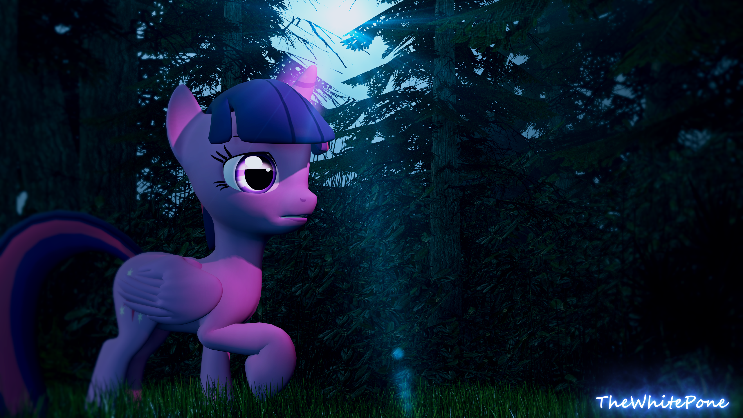
First off, what a lovely poster you made here.
You have composed this piece quite nicely, the colour pallet you choose (the cooler colours) really math Twilight colour pallet, they say warm and cold colours work best together, purple and blue are considered cold colours but that just gives the poster`s atmosphere a cooler feel, like its winder (without the snow) and the fact that the sun looks to be so low could also indicate longer nights like in winter for example.
You choose a simple pose that makes her look like shes walking in a cold forest at the time before sunset (which is most commonly known as twilight) if that was one of your visions it worked pretty darn well i will say!
The scene its self looks simple yet intricate all at the same time with all the small details of the trees, grass and so fourth.
Some things that could be improved:
With scene builds there all well and good but sometimes you may wanna change up the location, I do believe most of your posters are all inherently different but they do have similar aspects that all your posters have, its not really a bad thing but maybe experimenting with new skins and or objects could be really awesome!
For the sun, i think that it could be made even better if the rays went out a little more to show how powerful the suns rays are but the way it is now is pretty good never the less.
I do feel that Twilight's pose could be slightly altered, maybe not completely changed but maybe some aspects could be changed, id say make her look away from the sun just ever so slightly so we can see both of her eyes (but not fully because that might make it seem uncanny) as her pose is simple there are a lot of ways you could experiment with it which can help your poster a lot <img src="e.deviantart.net/emoticons/b/b…" width="15" height="15" alt="
Overall verdict:
I really like this piece a lot i can see a lot of time went into it, to make the effects just right and make twilight look like shes in deep peril lost in this lonely looking woods, but she has the last rays of the sun to guide her out of there, i just really enjoy the way you made this and i hope this helps <img src="e.deviantart.net/emoticons/l/l…" width="19" height="19" alt="